You may be running a highly lucrative online retail store with millions of dollars in profit every year, but are you aware that you could still be losing 2/3rd of your revenue through abandoned shopping carts?
Yes, studies reveal that 65%+ of online purchases are abandoned by customers. But, worry not! You can still win back a percentage of your lost customers by sending out compelling abandoned cart emails.
Captivating abandoned cart email designs are the key to recovering lost customers. Definitely not all, but surely a big portion of them!
So let’s dive straight in and delve a little deeper into the importance of using good “abandoned cart email templates” and how best you can leverage them to recover your lost sales!
What are these abandoned cart emails anyway?
Well, these emails are sent out to customers who abandoned their shopping carts midway after adding items to their carts. Although astonishingly underused, abandoned cart emails are tremendously efficient sales recovery tactic.
Meanwhile, you must realize that abandonment of virtual shopping baskets by customers is often not intentional, it may happen due to a loss in internet connection, crashed website, a timed-out site or the customer just felt that the purchase procedure was too complex.
Although abandoned cart email conversion rates are remarkably high. Surprisingly, these emails have an opening rate of almost 50% with more than 1/3rd of these clicks ending up in recovered purchases back on the website. However, more importantly, a persuasive abandoned email cart design with a great copy can do wonders in your efforts to regaining lost sales.
Ideal Abandoned Cart Email Template
Every design aspect or element of your abandoned cart email has a crucial role to play in retrieving a lost customer. It can mean the difference between salvaging the lost cart and losing it for good.
Here are some quick email design tips that you can follow to ensure that your abandoned cart emails do a stellar job in recovering some lost revenue.
- To increase the opening rate, your email must be easily recognized by the customer.
- It should easily convey the brand, purpose of the email (e.g. “You just left behind your item in the cart” or “Your shopping cart is waiting”), and include the abandoned item, if possible.
- Make sure that the content is simple and clear. It must convey the message to the reader in two quick seconds.
- The email must follow the same tone and branding of your website. An inappropriate voice makes it difficult for the customer to recollect the product or site that they left behind.
- It must accurately display the abandoned product details by making use of the content from your abandoned shopping cart platform.
- To make an abandoned cart email effective, it must include suggestions for related products from the abandonment system.
- The email must include a persuasive and clear Call-To-Action link to the checkout process making it easier for the customer to click, return to the website, and complete the purchase.
- Use of basic personalization is good (e.g. Dear John Smith). It’s a highly recommended tactic by some marketers, but it’s also considered ineffective by many others. So use your judgment.
- You can include a navigation bar if you want. This is claimed to be a great technique by some marketers to bring back customers to the checkout process, but some suggest that a simpler email is much more effective. So use your judgment here as well.
- It is recommended to include an “Unsubscribe” link in your abandoned cart email. Although it’s not a legal requirement to include one in a transaction email, it is courteous to have an unsubscribe link, which allows the customer to opt out normally without having to use the ‘Spam’ button.
Among the different elements in an abandoned cart email, the two most crucial aspects are the email subject line and the content.
Subject Line
The subject line is definitely the most debated topic among email marketers. If you perform a quick search, you’ll come across numerous suggestions on creating best-converting subject lines for your promotional emails. But no matter what domain you are in, one crucial trait remains the same – being honest and sincere about the email content. Well, that doesn’t stop you from being imaginative.
Take a look at some of the subject line ideas that you can incorporate in your own abandoned cart email templates,
- “We thought you might still be interested in these items”
- “Your items are waiting in the cart…”
- “Grab your items now, the 20% discount ends soon..”
- “Your forgotten items will run out soon..”
- “Are you sure you grabbed your items from the cart?”
It might be interesting to note that people like to hear from real persons, and not from an automated email address that reads “noreply@xyzcompany.com.”. Research shows that the emails from real people have higher open rates than the ones coming from the sales team of a company. Even though the results of this tactic weren’t long lasting, it still evoked interest among people when they perceived that the email is from an actual person.
Email Content
Creating great email content is definitely a balancing act. Your email content must not be overly insistent or irritating but at the same time, it must gently guide your customer to complete the abandoned purchase. Ideally, you shouldn’t send more than 3 to 5 emails in an attempt to salvage an abandoned cart.
An approach adopted by popular companies like Grammarly.com and Smileycook.com is to send 3 emails. Such firms usually take a customer service tactic in the first email, a rather commonly used technique.
In the first email, they try to help the customer by assuming that a technical snag prevented them from completing the purchase. Well, offering help can be sometimes a powerful psychological trigger as well.
The second email usually retains the customer service attitude displayed in the first email but it would also include a discount coupon worth 10%. But this email wouldn’t usually have links to their customer service department. In the third and final email, they would raise the discount to 20%, but won’t provide much additional information.
The content that works for one firm may not work for another, so it is highly recommended to test different content. But the rule of thumb here is to refrain from hard-sell approach and try to be helpful to the customer. Try to address their doubts and queries and gently guide him back to the checkout process.
Abandoned Cart Email Examples
Now, let’s review some abandoned cart email examples here and see what makes them outstanding.
Ghurka
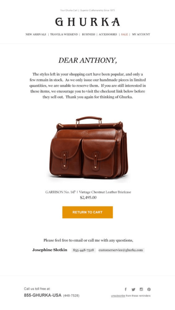
This email from Ghurka is one of the best examples of a great abandoned cart email. Did you notice how it starts off by addressing the customer by his/her name written in large fonts? Yes, the use of basic personalization can work to your advantage, and is a good element to incorporate in your abandoned cart email templates!
The following email content then subtly nudges him back to the sales funnel by triggering the sense of urgency. It is achieved by making clever references to the limited stock of the popular and bespoke leather bag.
The customer is also reminded of what he has left behind in the cart with the help of a conspicuous image and its basic details shown immediately after the content. The prominent yet not-so-pushy call-to-action button that follows then gets a higher chance of getting clicked, landing the already warmed up customer back to the checkout page for completing the abandoned purchase.
Nordstrom
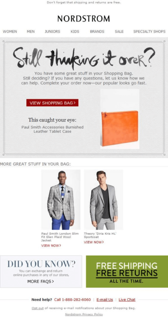
Nordstrom’s email has several elements that make it persuasive to the customer. The very aspect that makes it compelling is their use of unconventional yet powerful reminder title “Still thinking it over?” The following email content then offers assistance to clear any confusion that the customer might have had that led to the abandonment of the purchase.
The strong call-to-action and the subtle use of the psychological trigger of urgency can together improve the chances of the eye-catching call-to-action button being clicked to complete the abandoned purchase.
The incorporation of customer-friendly features of exchange, return, and free shipping in the email towards the bottom can also increase the chances of recovering the lost sale.
The presence of customer service numbers and other means to reach out the company can play a vital role in instilling confidence in the brand in the customer. Displaying related items with catchy images are also a great way to evoke the lost interest about the brand in the customer.
Doggyloot
Fab
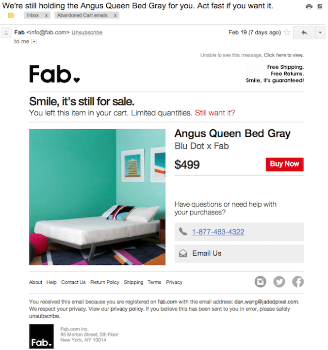
If you are looking to recover the lost sales of your big-ticket items then this abandoned email template from Fab.com Inc is worth analyzing. Apart from the usual reminder and usage of the psychological trigger, a large picture of the bed that’s incorporated in the email.
The Large picture is vital in reminding the customer of an abandoned purchase, especially of a higher-priced item. In contrast to low-ticket items, just the first item needs to be displayed to remind abandoned higher-priced items.
Unlike regular-priced items, the decision to purchase expensive items mostly requires more time and discussions with the family members. Customers of higher-priced products will usually have queries and doubts in their minds before they go ahead and click the ‘buy button. So it’s crucial to clear their queries and doubts about the item by inviting the customer for a chat or discussion, which can be accomplished by incorporating a customer service number or email support in your abandoned cart email design.
The folks at Fab have tried to accomplish just that in their email by integrating their contact details prominently adjacent to the product image, and right under the “Buy Now” button.
Kurt Geiger
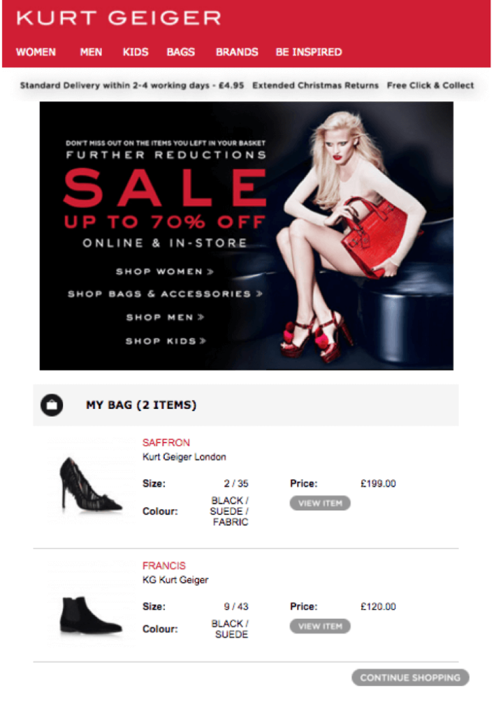
Apart from leveraging the usual elements that we discussed earlier in the previous “abandoned cart email designs”, the marketing folks at Kurt Geiger have used one more powerful tactic in their arsenal to increase the odds of recovering their lost sale – i.e. offering discounts. People just love discounts, so why not use it to your advantage while reminding them about an abandoned sale?
Wolf & Badger
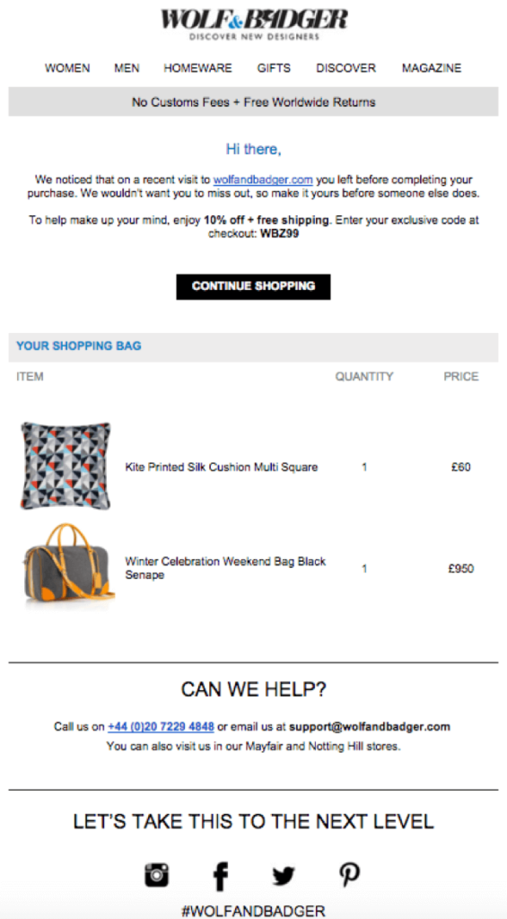
Who wouldn’t like to have their items shipped for free? Wolf & Badger tries to guide the customer subtly into their checkout page by making an irresistible offer of free shipping the forgotten goods. Free shipping along with the 10% off can give the customer a persuasive reason to click on the “Continue Shopping” button and complete their purchase.
Pacsun
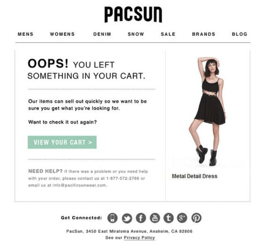
The Pacsun marketing team makes the customer feel sorry for forgetting the items in the cart. Being reminded of a mistake can make people regretful, which can at times act as a strong psychological trigger in completing an abandoned purchase.
Pacsun has very well used that to their advantage in their email title. This element along with the sense of urgency trigger and a prominent “View Cart” button should increase their abandoned cart email conversion rate.
Conclusion
No matter what approach you adopt to create your abandoned cart email template, one thing to keep in mind is to always experiment and test out your designs. Testing different designs and templates will help you distill the most appropriate email design that works for your business.
Sending out abandoned cart emails is one of the most overlooked and underutilized yet simple and powerful sales recovery tactics. So, don’t leave your money on the table when you can easily recover the lost revenue by sending a few simple emails.
If you’re thinking of personalizing the experience of your visitors, try FoxMetrics for free and Subscribe to our Newsletter get recent updates and news.

