If only the shopping cart were the last stop for the online shopper, and there was no such thing as an abandoned shopping cart. But alas, several online shoppers leave their carts – no matter how full – and may not return to the site to actually make the purchase.
According to the Baymard Institute, an average of 69% of online shoppers abandon their shopping carts, which does nothing to improve your ecommerce. So, how can this number get reduced and, in return, beef up your bottom line? The answer: a proper follow-up, recovery email.
While sending an abandoned cart email may seem like a longshot, actually 28% of these emails were opened, according to a report by Sale Cycle, completed earlier this year. Of the opened emails, another 28% of users converted and actually returned to their abandoned cart to complete the sale.
But in order to have this kind of success with a recovery email, there are several factors to consider before crafting the perfect look and brand messaging to send to your potential consumer.
Timing is everything
Once a potential customer abandons their cart, according to several online research, you’ve got a window of only a few hours to (most likely) win them back to make the purchase. So, send the recovery email soon after they leave your site. Depending on your target audience, you might try testing sending another recovery email as far as six weeks to two months out from the moment they abandoned their shopping cart.
Here is a breakdown of when customers are likely to complete a purchase after abandoning their shopping cart and receiving some sort of follow up marketing:
- 30% purchase in less than 20 minutes
- 50% purchase in 20 minutes up to one hour
- 60% purchase in one to three hours
- 65% purchase in three to twelve hours
- 72% purchase in twelve to twenty four hours
- 80% purchase in three to seven days
- 95% purchase in one to two weeks
- 100% purchase in more than two weeks
One other thing to consider is when exactly the visitor left the site. Was it because of a lead form that’s too long; an error with a discount code; or a glitch in the system?
If a larger percentage of your shoppers are leaving your site in the same spot, you might have some friction that needs to be cleaned up. The moment a visitor leaves the site may also help you tailor your emails to help get the customer back to the site.
Craft a catchy subject line
Aside from the sender, the email subject line is the only other cue to the reader what they’re about to (hopefully) open. So, step number one is to make the email “sender” an obvious part of your brand so the receiver will have no doubt who it’s from.
Next, consider the subject line. According to Marketing Sherpa, you have nine to fourteen words (or approximately 50 characters) that are visible to the receiver in the email subject line, so make them count! You don’t want to write a lengthy subject line that’s going to be cut off by the email provider.
We suggest a few different tonal approaches when it comes to the recovery email: humor, friendly, call to action, offering incentive, or troubleshooting the checkout process.
Some examples of successful recovery email subject lines include “Your shopping cart misses you”, “Reminder: There are items in your shopping bag”, “Forgot Something?”, “Thank you for shopping”, and “Don’t leave a good thing behind”, among others.
No matter what method of messaging you choose, always make sure it is in-line with your brand, and if possible, is customized for the potential shopper in any way.
Incorporate elements of your website
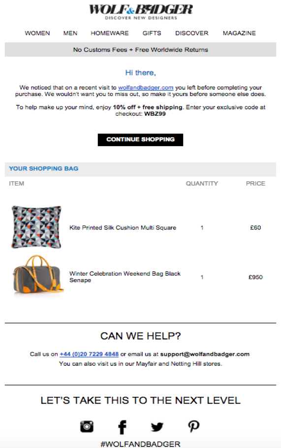
The look and feel of your brand should come across clearly in your recovery email. You will want the email to have similar elements to that of your website. Incorporating the main navigation from your website will offer something recognizable to the customer, while also easily linking them back to your website to shop.
Take a look at this recovery email (below) from Wolf & Badger, for example. The email includes the brand’s logo and header, along with their website’s complete navigation, as well as links to their social media channels at the bottom of the email.

Showcase their abandoned cart
The Wolf & Badger recovery email also does a nice job of showcasing what the customer left behind. Show them what they’re about to miss out on if they don’t make the purchase!
Visuals of the abandoned cart will help entice the customer to return and complete their purchase.
Send the right message
The tone of the email must capture many different jobs simultaneously. It’s important to speak the language of the brand, while also making the customer feel a sense of immediacy to return to their cart and complete their purchase.
Don’t make the email too lengthy, and be sure to include a way for customers to easily return to the site, along with their shopping cart, and a way to connect with customer service.
Get the right aesthetic
Make sure the look and feel of your brand comes across in your emails as well. The customer should know right away – from the logo, colors, fonts, and language – exactly what company they are dealing with.
It’s also important to test any email you send to make sure it’s properly visible in all email providers, as well as on any mobile device, and even desktop computers. Don’t lose a potential customer simply because they can’t open your recovery email.
Don’t forget a call to action
The main point of sending the recovery email is to get the customer to make a move; particularly, to get back to your website and complete the original purchase they abandoned. So, make the language in your email very action-oriented, and offer at least one (don’t go overboard and put calls to action all over the place) very clear call to action.
According to Campaign Monitor, you should have one main call to action, with possibly one secondary; good placement of your call to action (above the fold, or below the fold, depending on the email); make the call to action a button that’s a little bit of a different color from the rest of the email; and be sure to test it to make sure it’s working and tracking properly.
Include similar items they may enjoy
Aside from showing the customer what they left in their abandoned cart, it’s also a great idea to show them similar items they may like. Believe it or not, customers actually like it when they see a company is working to get their attention – so, show them you know what they would like based on the items in their abandoned cart.
According to Marketing Charts, 74% of customers say they get frustrated when email marketing efforts aren’t targeted toward them. Salesforce says offering additional items a customer could be interested in will increase your conversion rate by 10% and bump up your click through rate by 50%.
Show off customer testimonials
While it is often difficult to pinpoint exactly why a customer abandoned their shopping cart, there is a chance they weren’t completely sold on the items they originally chose, or they need more information about the products. One way to tackle this is to provide customer testimonials within your recovery email.
Showing positive reviews of the items the customer was about to purchase may be the trigger that pushes them back to your site to complete the purchase. Customer testimonials could be in the form of short video clips, written customer reviews, or perhaps a ratings system.
Include sweet perks
Offering an extra incentive for the customer to return to your site and make the purchase is always a cool option. You could throw in free shipping (if applicable), a percentage off, or a free perk. According to ConversionXL, the number one reason customers abandon their shopping cart is due to unexpected costs, and 61% of shoppers likely won’t complete a purchase if free shipping is not an option.
You could also offer your customers who receive a recovery email an opportunity to join an incentive program. Customers are more likely to shop with a brand they are a member of, and according to Maritz, more than 45% of consumers say the opportunity to gain rewards is a large reason for purchasing from a brand.
However, it’s recommended to be cautious of always offering incentives, because you don’t want your customers to get in the habit of abandoning their carts or postponing a purchase in order to wait for an emailed incentive.
Offer further action
Even in recovery emails, it’s important you offer your customers ways to interact with your brand in all ways. Include an option for the customer to opt out of receiving any and all emails from your company, even though you don’t want that to happen.
Also, provide links to other places the customer can get involved with your brand, whether it’s through your social media channels, blog, newsletter, or ways to reach your customer service.
Don’t start spamming
Many companies wonder how many recovery emails they should send to a customer, and in what span of time? Of course, this really depends on your target audience and what is going to work best for them. However, you don’t want to overload any potential customer to the point where they shut you out for good.

Finding the right amount of email communication to have with your target audience takes time and testing, and repeating it all over again.
Examples of Successful Recovery Emails
Now that you’ve got all twelve items on your checklist, you are well on your way to creating a successful recovery email. But what does it look like when all of these tips are tied together in a final product? Here are some examples of recovery emails done well.
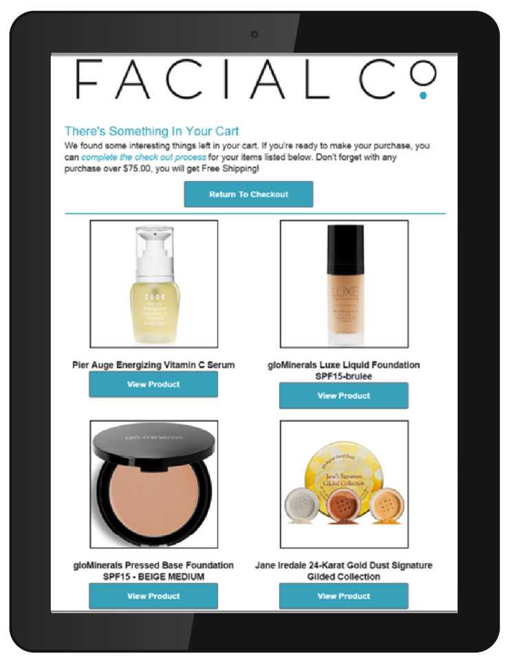
Consider this recovery email from FacialCo, (left).
Their brand is clearly defined right at the top of the email, followed by an in-text link to complete the purchase.
There is also a reminder about the opportunity to get free shipping, with images and short descriptions of what the customer left in their shopping cart.
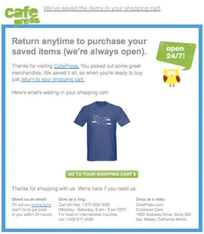
Next, let’s take a look at this recovery email from Cafe Press (left).

Their unique logo is right at the top of the email, and they open by telling the customer that the items left in their shopping cart are still saved.
There is also an in-text link for the customer to return to their cart, along with a picture of the item they left behind.
Finally, they offer three different ways to get in touch with them, including an email link to reach customer service electronically.
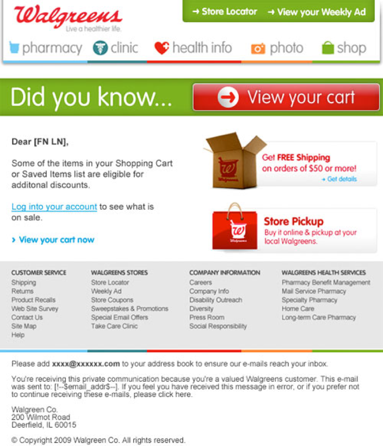
For the last example, let’s examine this recovery email from Walgreen’s (below).

Walgreen’s has done a great job of incorporating the entire look and feel of their website right into the customer’s email inbox. At the top left are two clear calls to action, inviting the customer to visit a store in-person, and to check out their weekly ad.
The website’s navigation is right below the branded header, and there is a large, bold button enticing the customer to return to their shopping cart. The incentives are clearly labeled: the option for free shipping and in-store pickup.
Notice, at the bottom of the email, is a complete footer from the website that includes several links for additional information. And finally, there is an option for the customer to stop receiving emails from Walgreen’s in the fine print.
Sure, abandoned cart emails have several components to them and do take a good amount of marketing genius. However, remember that large number of consumers who leave their carts behind – 69% – and it’s time to up your conversions and sales. The perfect recovery email may just be your answer, as long as you do it right.
If you’re thinking of personalizing the experience of your visitors, try FoxMetrics for free and Subscribe to our Newsletter get recent updates and news.

