Who doesn’t love a good story? To kick off this article, we’ve got a great one for you:
Once there was a Web analytics professional who was also an Excel wizard. In fact, he would create some of the world’s most beautiful spreadsheets on a monthly basis. But as beautiful as his analytics reports were, they failed to impress his boss. One day, he woke up with an impeccable ability to spin his data into powerful stories. At year’s end, he got a promotion and a big raise.
Ok, so one doesn’t suddenly wake up with a storytelling ability. Nonetheless, it’s a vital skill for any analyst who wants to make a difference (and, let’s face it, gain a little more credibility). The reason is simple: data is complicated. No decision maker wants to get “in the weeds” staring at spreadsheets that make her head spin. To sell through new ideas, you must present compelling yet easily digestible facts that are easy to communicate up the ladder.
To “numbers people,” this doesn’t always come naturally. But with a little practice, anyone can become a great data storyteller. Here are a few ideas to get you started.
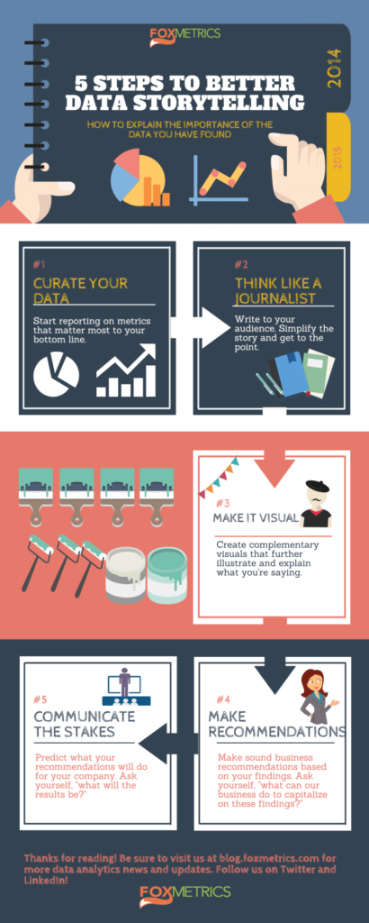
- Curate your data. To begin separating the wheat from the chaff, take a good hard look at your current reporting. Are you measuring what really matters? While increased month-over-month page views may make you feel warm and fuzzy, this means little to your bottom line. You’ve defined your KPIs, right? Dig deeper than vanity metrics, and start reporting on the metrics that make or break your success. (Hint: if you can’t do this with your current analytics software, it may be time to invest in a more advanced analytics tool).
- Think like a journalist. In other words, write (or present) to your audience. At most companies, the movers and shakers
don’t want to be bored with technical analytics jargon. So simplify the story. Give the Who/What/When/Where/Why, and get to the point quickly. - Make it visual. There are countless data visualization tools out there. If you’ve got a little DIY streak in you, tools like Canva can help you create simple infographics. Canva also offers helpful articles and tutorials for making your designs look more professional. Want to leave the visualization to the true creatives? Paid services like Visually may be a great solution.Need a little visualization inspiration? We love David McCandless’s TED Talk on data visualization.
- Make recommendations. Stakeholder’s always want to know “what’s next.” So it’s a good idea to present recommendations based on your findings. If a particular ad campaign is converting exceptionally well, should we increase budget allocations to that channel? If customers are dropping off at a certain point in the funnel, are there UX or content improvements that might help nudge them along the journey?
- Communicate the stakes. There’s one important piece missing after you’ve made your recommendations: predictions. How much more money does your company stand to make if they do as you say, and increase revenue to the ad channel that’s outperforming the others? How much revenue would they lose in the next 6 months by ignoring the funnel drop-off issue? Having compelling predictions is the surest way to get decision makers to take action.
Data, in any form, is powerful. But using these techniques, you’ll take your data from powerful to unforgettable.
What are some ways that you’ve used data storytelling to influence a decision in your company?
If you’re thinking of personalizing the experience of your visitors, try FoxMetrics for free and Subscribe to our Newsletter get recent updates and news.

