Providing customers with too many options may be a bad idea after all. Most people will say yes if you ask them if they prefer having more choices. Options can’t possibly be a bad thing, right?
But when it comes to sales, having too many options can hurt your conversion rates.
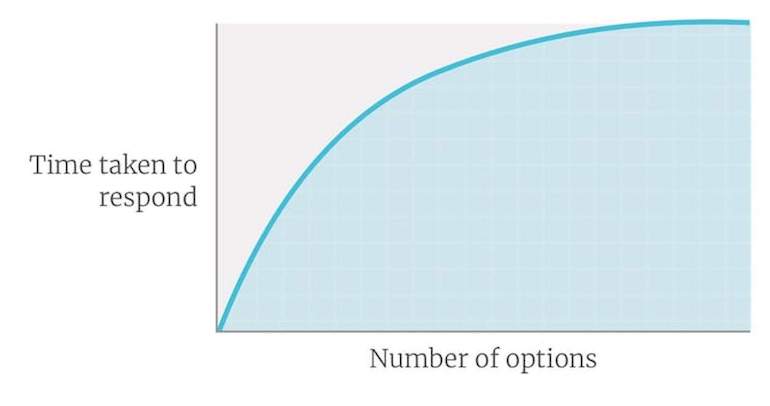
The reason for this is because, while individuals enjoy having options, they can feel overwhelmed by them. Hick’s Law explains this perfectly. It claims that as the number of options accessible increases, so does the time it takes for someone to decide.
Researchers experimented with a local grocery shop. They set up a jam-selling booth in the store. On specific days, the booth would sell 24 different jam types, while on others, it would sell six. The outcomes were noteworthy.

The research showed that having too many options can reduce conversion.
On days when they marketed 24 different variations, the conversion rate was only 4%. However, when only six options were available, the percentage increased to a stunning 31%.
So if you limit your customers’ options, they’ll be less likely to become paralyzed by them.
Now That You Know The Problem, What Can You Do To Reduce Choice Paralysis?
Unlike a grocery shop, an eCommerce shop has more control and often offers more options. Here are some steps to reduce Choice Paralysis and increase your conversion rates.
1. Make It Easier For Customers To Choose
I know it’s quite difficult to eliminate some of the options on your website, but there’s compelling evidence to support the action.
You first need to identify your bestselling options. FoxMetrics can help in this regard. It will allow you to determine your bestselling products, as well as the options attracting most of your customers.
With this information in hand, you can then limit the number of choices you offer your clients.
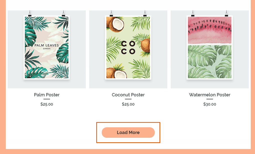
If you can’t remove options, you can at least direct consumers’ attention to the most popular selections. You could, for example, show the best-selling product categories while hiding others behind something like a “more” button.
2. Make The Best Choices Stand Out.
When faced with 24 different types of jam, the issue for the customers wasn’t just the amount. They were also weighing the pros and cons of each option.
The more similar options you offer, the more difficult it will be for your customers to choose. Even deciding between two products can be tough if they are similar.
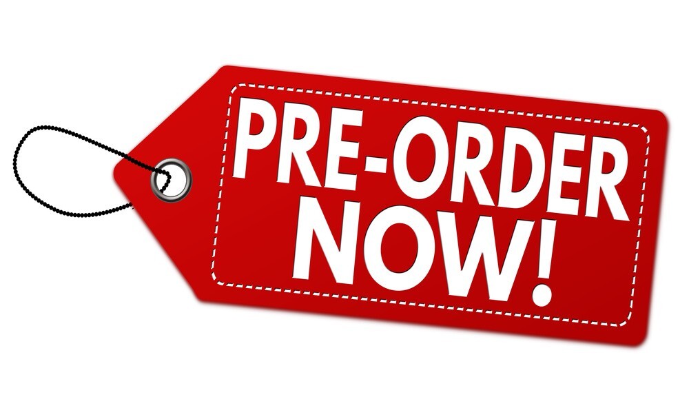
The Amazon app for mobile devices, for example, features a search box with two buttons. The first one says “Preorder Now,” and it takes you to the checkout page, while the other says “Preorder Today” and adds the item to your shopping cart.
But even this modest number of choices can be difficult. Most customers will be stuck choosing whether to order now or later. What you can do in such a situation is to make the obvious choice to stand out. So if you have two buttons like Amazon does, you can make the “Order Now” button bigger and bolder.
3. Reorganize Your Options
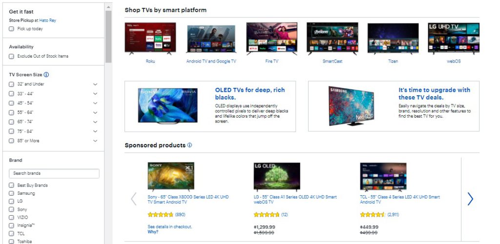
Instead of providing customers with endless options all out once, consider allowing them to choose what they want. For instance, if you sell mobile phones and have over a thousand phones available from various brands. Your landing page should only contain less than 10 of those phones (probably your best sellers).
What you should do is to have a search feature on the side of your landing page, where customers can search for the mobile phones they want based on various parameters like price, brand, screen size, battery duration, operating system, and more.
This is what Best Buy did with their TV section. While they had over 200 different TVs on sale, they only listed six on their landing page and allowed customers to search for what they wanted.
4. Provide Your Customers With The Information They Need To Make An Informed Decision
So let’s say, for example, your company sold ice cream flavors and provided two flavors, one of which was Chocolate Chunks and the other was Chocolate Brownie Chunks. Some customers could be confused about choosing between the two.
When faced with such a situation, most customers would opt for the one that has sold the most units, has the best value, or has the highest customer satisfaction rating. Some may exit the site because it’s too difficult to choose since they’re similar. But the ones that stayed back will need that information to make a decision. Else they’ll also be paralyzed.
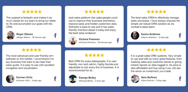
Insert as much information as possible in the description for both products. Highlight their best features and include customer reviews and ratings on the product pages.
5. Allow Customers to Compare
Perhaps a customer is in the market for a car and has several options ranging from paint color to financing. When it comes to more complicated products, breaking down the options can help customers confidently purchase the perfect product for them.
Apple does this on its website. They have a section where users can compare various phones and laptops based on battery life, size, storage, display, and other factors.
If that doesn’t work for customers, they are then directed to speak with a CS agent to help them pick the best fit.
6. Encourage Quick Decisions
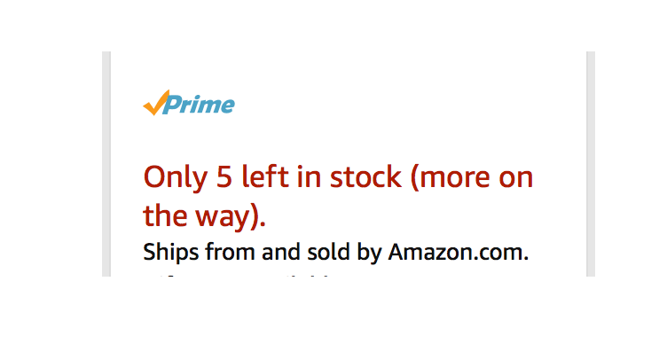
The longer a customer browses a website or sits with things in their shopping basket, the more likely they are to abandon it or feel hesitant to purchase. As such, businesses should encourage customers to make quicker decisions, as that reduces the likelihood of being paralyzed by choices. Lulus, a clothing manufacturer, found out that by adding “ONLY 5 LEFT!” next to the price of a piece of clothing, customers bought more. The limited method drives customers to make quicker decisions.
Another way to help customers make quicker decisions is to offer different prices for similar products. So product A could be a bit higher, while product B could be lower. Customers who are on a budget will likely go for the cheaper option.
Similarly, you can distinguish products by their shipping type. Offer free shipping for one and not the other. Customers love free shipping and as such will go for products that are shipped for free.
What’s Next?
Take a peek at your clients’ data using FoxMetrics, and find the pages with the highest exit rates. It wouldn’t surprise me in the least if those pages forced people to make a decision they weren’t ready to make, resulting in choice paralysis. Fixing these issues could have a significant impact on your clients’ conversion rates and revenues.
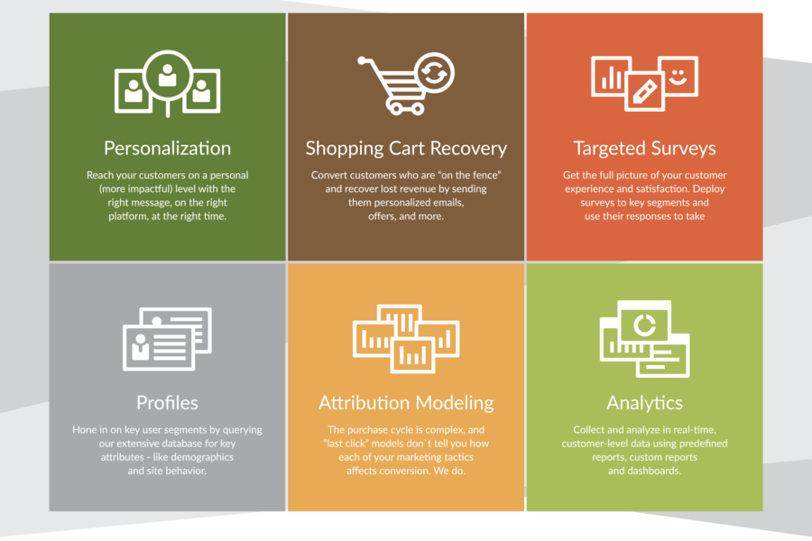
Additionally, you can collect data on your site visitors using FoxMetrics and then use that data to identify and show them the product option they are likely to be interested in.
Want to try it for yourself? Sign Up for a Free account or request a demo account.

