If there’s something that is keeping e-commerce retailers from boosting their sales, it is shopping carts abandonment and guess what…it’s really a big one!
According to a retail marketing firm—Listrak, the average rate at which an average buyer abandons their cart before completing an order is 81%.
This suggests that majority of ecommerce sites are losing three-quarters of shopping carts which are abandoned before consumers cross the line & convert.
That being said, let’s see what all you can do to cut down on shopping carts abandonment:
- Simplicity & Design
- Flow
- Guest Checkout
- Create account after
- Save for later/add to wish list
- Display product availability
- Crisp product images
- Mobile friendliness
- Fast page loads
- Simple discounts/coupons
- Free Shipping
- Transparent Additional Fees
- Security
- Ease Of Access To Shopping Carts
- Simple Navigation
- Simple Checkout Flow
- Multiple Shipping Options
- Multiple Payment Options
- Include card logos and seals
- Eliminate or Minimize Distractions
- Obvious Customer Support
- Display Trust
- Guarantees
- Clear Return & Refund Policies
- Icons & Logos
- Analytics & Testing
- Track & Monitor
- A/B Testing
- Marketing
- Retarget Lost Shoppers
- Abandon Cart Emails
Simplicity & Design
In spite of the increase in abandoned shopping carts, Business Insider reports that about 63% of items can actually be recovered by e-commerce sites. The solution is to simplify your site’s design and checkout process.
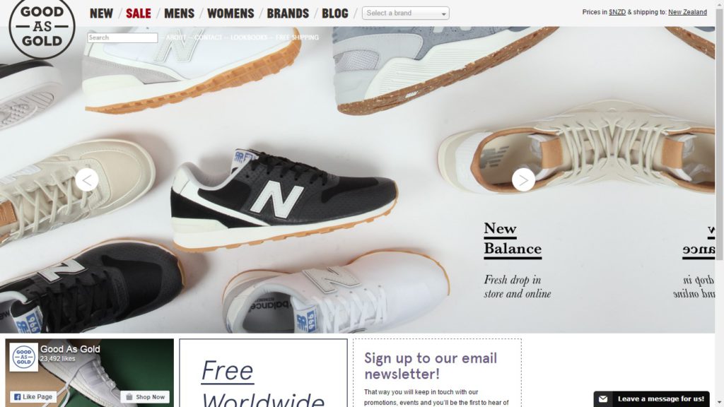
Based out of Wellington, New Zealand, Good as Gold has a loud & impressive eCommerce website. While big homepage images entice you in, multiple ways to navigate the site add to your shopping experience at Good as Gold. For instance, huge drop-down menus and the brand’s page that feature each vendor listed from A-Z is like icing on the cake.
Flow
A clean, visual search page makes it easier to view designs and quickly navigate through hundreds of products without any hassle. While the filters should be intuitive (in terms of Size, Style, Price), they should be fun (sort by: awesomeness) to making short-listing available options a breeze.
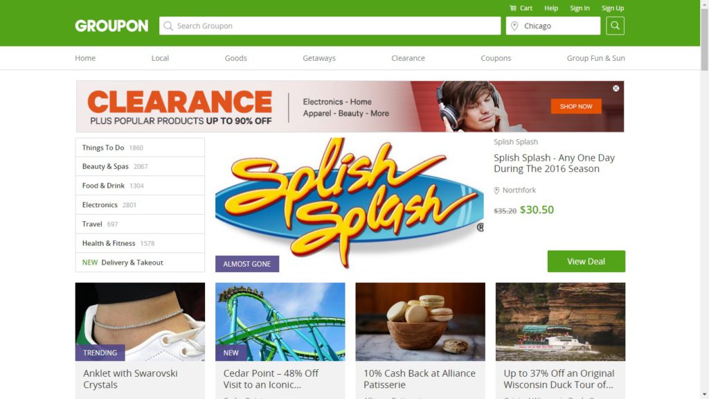
While you might be confused by the unlimited stock of Groupon, their checkout process is a benchmark when it comes to simplicity, social proof & instant gratification.
Guest Checkout
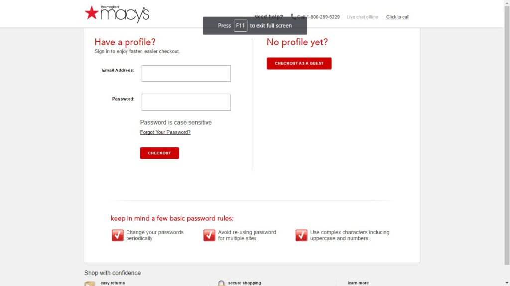
Offering an option to check out as a guest must be a standard practice across the e-commerce industry although 24% of online sites don’t. Perhaps, a buyer is less likely to complete a purchase if they need to go through the difficult process of signing up for an account & confirming it.
Macy’s Guest Checkout
Amazon doesn’t offer Guest Checkout
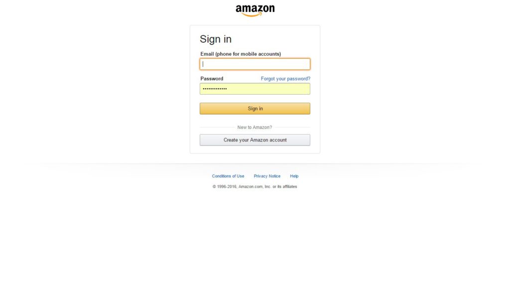
Macy offers guest checkout whereas Amazon doesn’t.
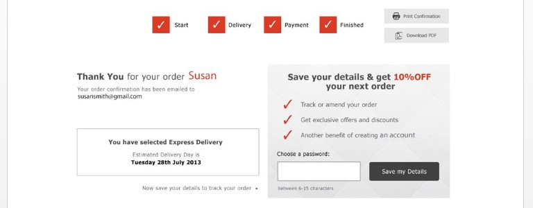
Create account after
There’s nothing more disgusting than witnessing “Register to Create an Account!” popup before you complete your purchase. You’ll be amazed to know that online retail sales went up by $300 million just by removing the register button.
Please note that customers will gladly share their contact details so as to track their order after purchase instead of stopping to fill in all details beforehand.
Save for later/add to wish list
Allowing customers to “Add to wishlist” or “Save for later” will forbid those who aren’t sure about the order. According to research by SeeWhy “99% of new visitors didn’t purchase on their very first visit. Rather, it took multiple visits & even multiple shopping carts abandonments to pull off the order.”
So, this feature works!
Display product availability
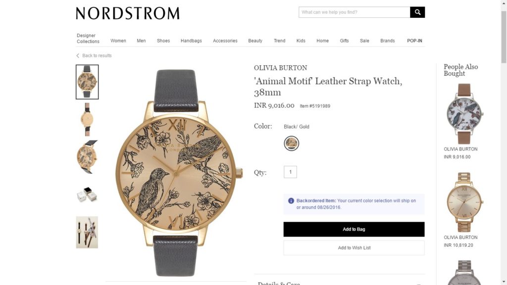
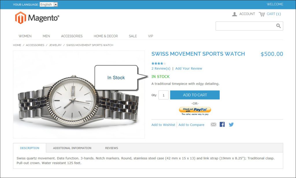
No customer wants to go down the entire funnel only to find out the product they have selected is no longer in stock. Fortunately, majority carts have inventory tracking integral to ordering process. In case a product is on backorder, enable customers to type in their email ids to be notified if it’s available in stock.
Crisp product images
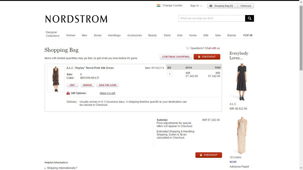
Offer crystal-clear thumbnails of items shopper is buying instead of simply putting text to describe what they’ve actually bought. In a nutshell, it’s always best to show crisp images of product(s) in the cart.
Amazon Cart: No Images
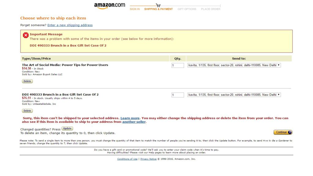
Nordstrom Cart: Proper Thumbnails
Mobile friendliness
While shopping carts abandonment, for desktop online shopping witnesses a downfall of 68%, it is 97% for mobile phones.
Moby Kay Jewelers

While the mobile checkout process by Moby is responsive and functional (as it contains bare essentials), Kay Jewelers shows how an easy thing such as online shopping can instantly turn into a cumbersome process.
Fast page loads
Low bandwidth is one of the major reasons why few shoppers abandon your cart. So, you need to proactively rev up your shopping carts by avoiding unnecessary graphics and other desktop elements.
Simple discounts/coupons
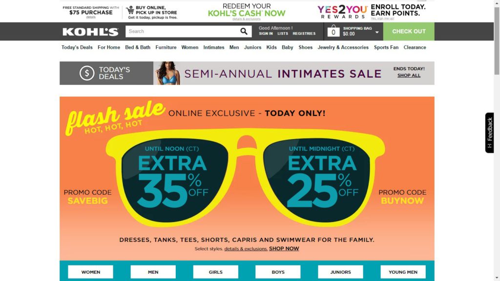
According to E-tailing survey, “About 62% of online buyers think that it’s important for online stores to have dedicated section for exclusively priced products. This can include everything from items on sale, products cleared from clearance sale to coupon codes.”
For example, sale items are prominently shown on e commerce stores of leading sites, involving dedicated sections for sale & clearance items.
Free Shipping
According to a survey conducted by Visual Website Optimizer in 2014, about 28% of shoppers abandoned their shopping carts due to unexpected shipping costs. While the number is not that big but when compared to other factors, it emerges as the major source of shopping cart abandonment.
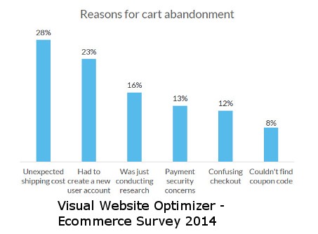
The key takeaway being 76% of online buyers added items to their carts to qualify for free shipping.
According to a web story, Zappos that offers free shipping and free returns on all domestic orders with no minimum order size produces an excess of $2 billion in revenues annually. The company does everything to live up to its overarching ethos and the tagline “Deliver Wow”, free shipping being one of them!
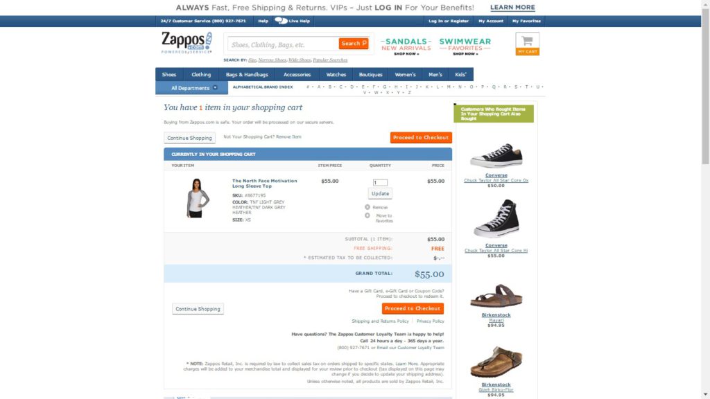
Mind you, online shoppers don’t love surprises. If you ask me, I would like to be informed about the shipping charges (if a site offers paid shopping!) on the product page itself rather than dragging me through the whole funnel only to have me abandon my shopping carts at the end.
This brings me to the next point!
Transparent Additional Fees
While it’s easy to assume that shopping carts abandonment takes place because of people’s uncertainty of their purchase, the reality is there are multiple reasons for abandonment “not being ready for purchase” being the third reason, according to a survey from BI Intelligence Estimates in 2014.
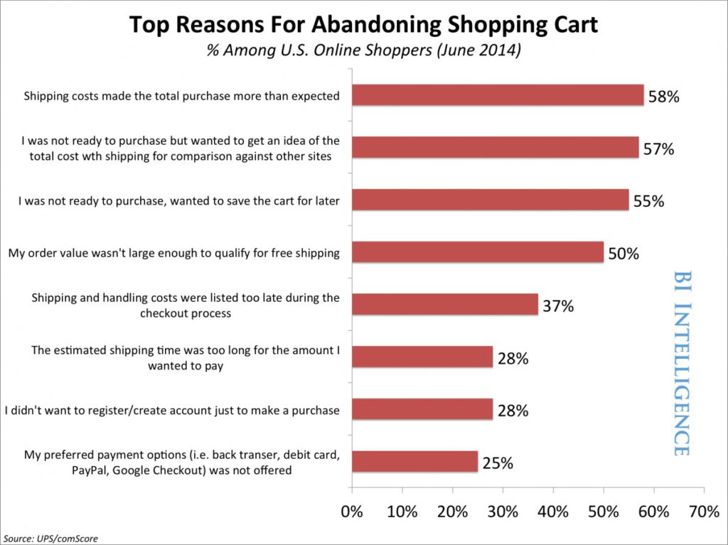
Perhaps, a number of reasons are actually about transparency of additional or total cost including the shipping fees. Buyers are often seen complaining about no-up front information on total costs.
Therefore, it’s significant that your customers get all the information up-front. Please note that long gone are the times when you could trick customers into paying more money—if you cannot offer a crystal-clear overview of your order costs, they will definitely leave your store and purchase at your competitor’s site.
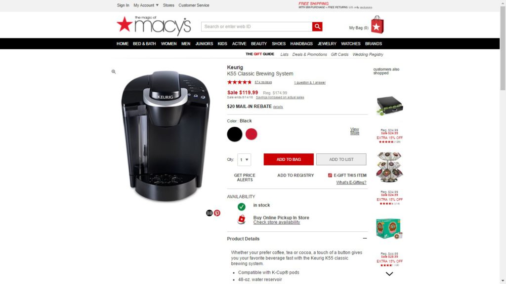
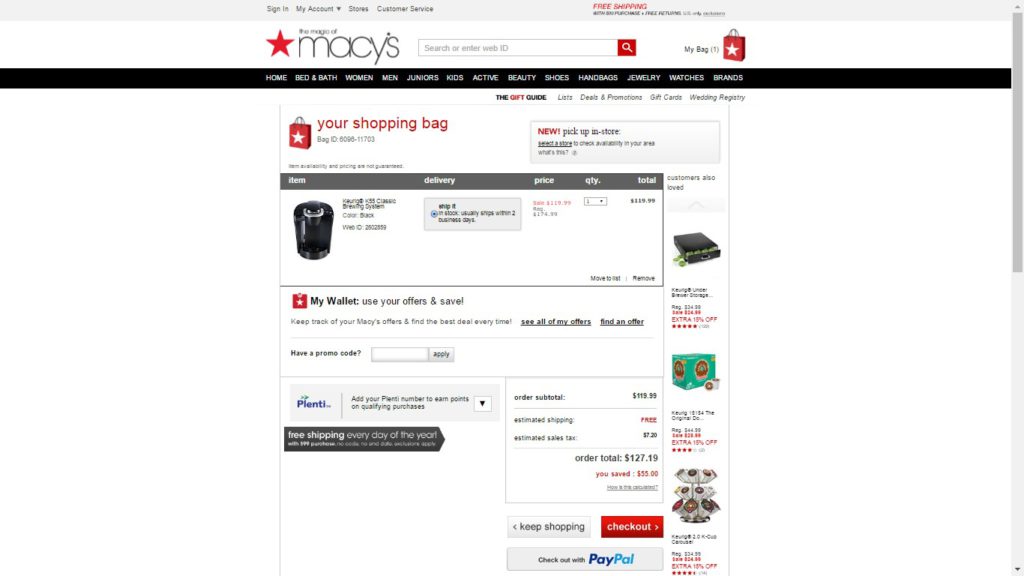
Now, take a look here:
Here the original product page shows the cost as $119.99 and when you proceed to checkout, you’re presented with an additional charge of $7.20. This forces you leave the cart without completing your purchase.
Security
Today’s buyers are smart shoppers and are aware of security issues such as SSL certification & PCI Compliance, thereby are hesitant to trust you with credit card details.
Hence, it becomes really important to highlight your security badges during checkout procedure.
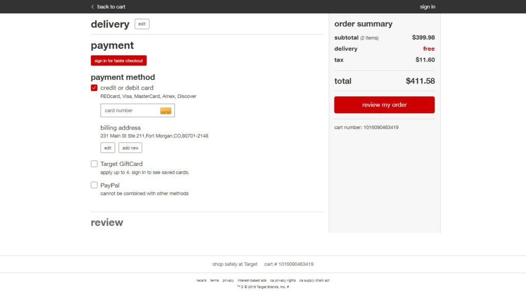
For instance, Nordstrom has a very secure checkout procedure than Target that does not use any security standard on its site other than mentioning “shop safely at Target”.
Take a look:
Nordstrom’s Secure Checkout

Target’s Checkout Procedure
Ease Of Access To Shopping Carts
Placing the shopping carts at an accessible place alone will not serve your purpose of avoiding abandoned carts. You really need to make sure that a shopping carts are visible to customers at all times while they’re shopping online.
While it would eliminate the unnecessary hassle of navigating the website to find their shopping carts, it would also help your customers keep track of their added items as they shop around.
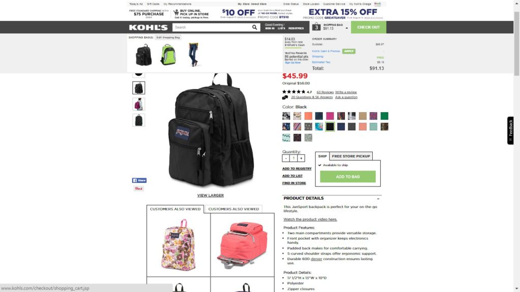
I really like Kohl’s shopping carts which is not only righteously placed (just next to checkout on the right side) but is also instantly available for a quick preview of added items. Perhaps, each time you add a new item, it drops off instantly to show the current order summary instead of navigating to a separate page.
Needless to say, it leads to an estimated fall in card abandonment by 4-8%.
Simple Navigation
It’s just an extension of the preceding point. Making navigation simple between your cart and e-commerce store can prevent users from abandoning their shopping carts while they’re checking out.
Don’t forget customers expect online shopping to be as indirect, inefficient, and random as shopping in a real store. So, if you make it easier for shoppers to move between their shopping carts & your store, the more they’ll stay hooked and complete purchase.
Well, the best way is to reduce the friction during checkout process by consistently experimenting with your checkout flow in order to accurately optimize checkout experience & make it simpler for buyers to purchase more stuff.
So, rather than forcing your customers to click “Back” again and again, you should focus on making your navigation more logical and intuitive between checkout & product pages.
Simple Checkout Flow
It is believed that about 10% of shoppers abandon their carts just because they’re thrown open to an extended checkout process.
Multi-page checkouts with unnecessary forms, questions, products and steps is something that make shoppers feel like hell.
However, from a customer’s perspective, it’s not at all encouraging as they want a simple yet functional system that lets them complete their purchase without any struggle or time-wastage.
Indeed, fewer steps will ensure a highly usable system that minimizes time needed to fill out different forms or answer multiple questions.
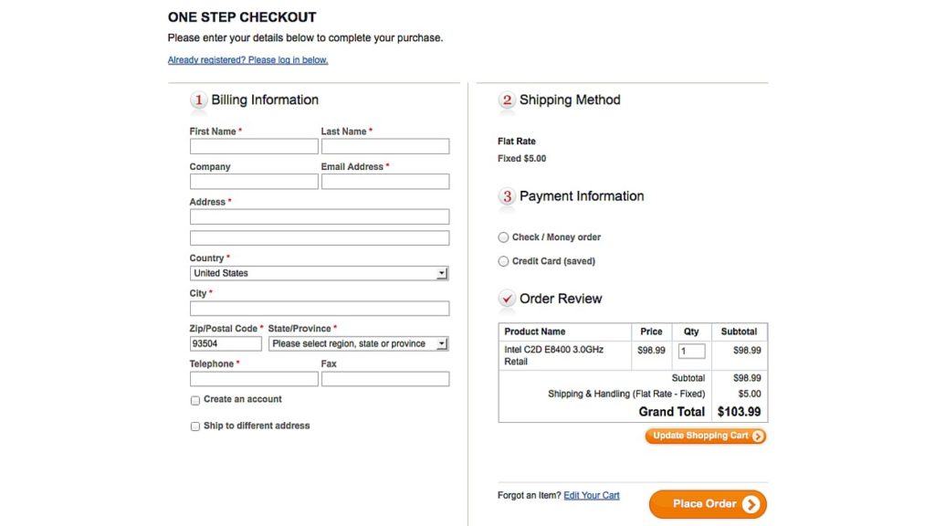
So, what you can do is provide an “Express Checkout” feature that lets customers buy really fast, checkout, and instantly complete their purchase.
Just like One-Step Checkout:
Multiple Shipping Options
When it comes to online shopping, shipping is considered a huge pain as according to them it’s costly, delaying, and inconvenient. However, if you add multiple shipping options to shopping carts, you can actually remove friction for users who’re shopping online.
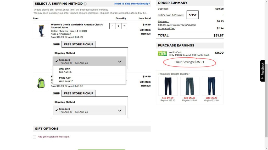
Kohls utilizes a great combination of means to show that shipping is not really an issue with them. While they offer estimated delivery time (standard, one day & two days) shipping, they also offer free store pickup as well. Free shipping for higher value orders and International Shipping through MyUS.com are other shipping options provided to shoppers.
So,
- Provide all shipping options that remove friction while ordering online
- Offer free store pickup if your company owns physical locations
- Provide shipping deals which lower costs and increases delivery time
- Use info filled up by user’s location & account to display personalized shipping choices or estimated delivery time.
Multiple Payment Options
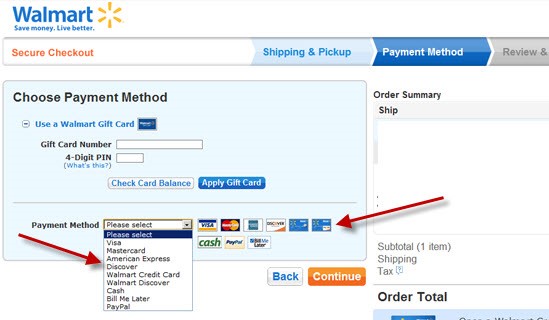
You’d all want to remove the friction between a shopper and his shopping experience but this can’t happen if you’re offering only one payment option. While multiple credit card payments are a no-brainer these days, today’s smart customers demand more choices to pay for shopping online.
This includes everything from third party payment services like PayPal/Skrill, a variety of credit cards, several reward cards, mobile payment systems like Apple Pay & Google Wallet to receiving payments via check. While this will fill in any gap in payment method inconvenience, it will also result in purchases from new buyers who haven’t purchased from you before.
Include card logos and seals
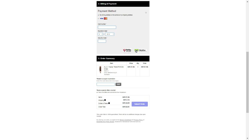
Though online credit card transactions are a common thing nowadays, a new customer might need the guarantee that implies security or privacy of your website pertaining to his personal information. Norton Secured, McAfee Secure, TRUSTe are few trust symbols to communicate additional website security.
Nordstrom’s Secure Checkout: Trusted by McAfee Secure & TRUSTe
Eliminate or Minimize Distractions
Customers hate distractions when it comes to online shopping. Therefore, you should prevent dropping off of shoppers who are about to purchase from you by removing all the distractions.
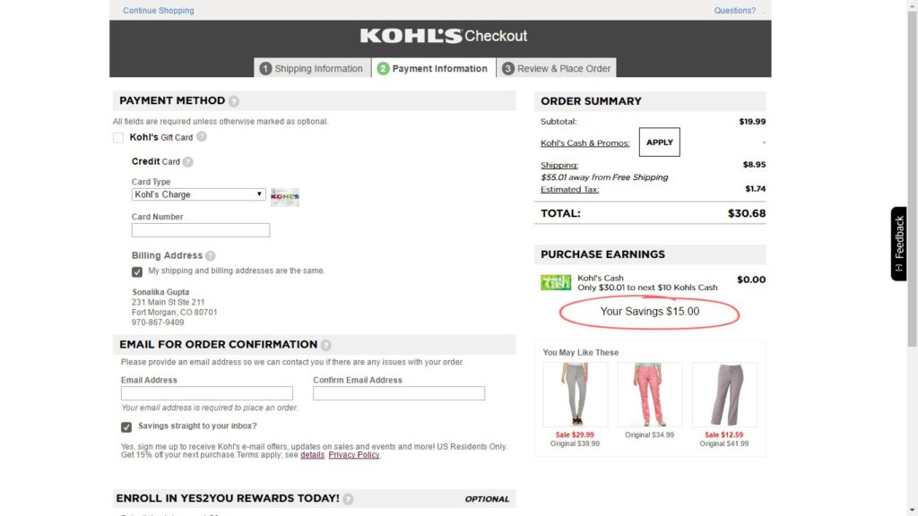
While offering free shipping is a great way to enhance the value of a sale, it also risks stretching the task. Perhaps, here you’re inviting buyers to become distracted by looking for other things to purchase. Hence, shoppers with a limited budget will be confused and may finally give up & purchase elsewhere.
Other than this, prompting them to search for a voucher code and blocking the buying process with a login/signup wall are other things that shoppers might not appreciate.
Kohl’s Checkout: A very distracting payment procedure
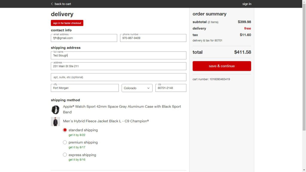
Target’s Checkout: A customer-friendly payment procedure
Obvious Customer Support

Providing your customers a chat box or toll-free telephone number on your checkout page not only lends them confidence but also resolves their concerns (if they have any!) as well. Besides, if they have a query, they can ask it on the spot instead of leaving your website and hoping that they will get the query resolved later when they come back.
So, please remember there is no substitute for customer service whether it’s in the form of live chat, telephone or email support.
Display Trust
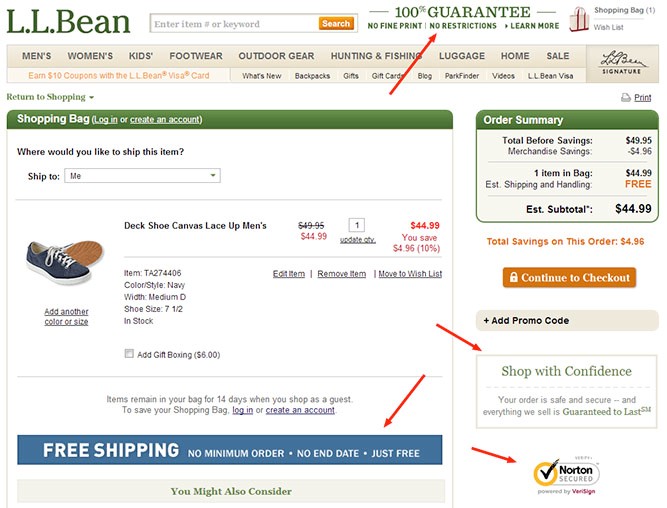
Be prepared to lose a big chunk of your website visitors (before they complete their online purchase) if you don’t have an SSL certificate, a clear refund/return policy, a money back guarantee, a price guarantee, lock icons, security badges and privacy policy on your site.
Guarantees
Please note that 36% buyers don’t finish their purchase just because they don’t get a price guarantee. By giving your buyers a price guarantee, you actually give them the confidence that they have grabbed the best deal and need not compare product’s prices with other e-commerce sites.
Clear Return & Refund Policies
A transparent and practical return or refund policy adds peace of mind to shoppers and their overall shopping experience!
Icons & Logos
Online shoppers rely on sites more only when they come across trust seals. According to VWO Survey, about 13% carts were abandoned because of worries over payment security.
Just have a look at your cart analytics to know if you’ve an increased number of drop-offs at payment stage. Just get an SSL certificate added to reassure buyers that their information is safe & secure.
Analytics & Testing
Before you try to fix the problem of shopping cart abandonment, first you need to know the reasons behind one. So, instead of guessing at what the reason could be, you should pinpoint the problem with tools like Google Analytics.
Track & Monitor
By tracking and monitoring your checkout funnel you can figure out at what stage buyers are abandoning shopping carts and see if that corresponds with one or more reasons. As soon as you identify the problem, you can test a number of solutions and build the conversion machine your online store is supposed to have.
A/B Testing
Also known as bucket or split testing, A/B Testing allows you to compare two versions of a webpage or app against one another to identify which one does well.
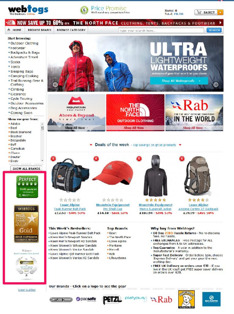
While it can be alluring to sit back and enjoy the show go on with minimum input from you, the A/B Test can generate extra revenue. So, the chances you’re actually leaving money on table are quite high. See how Webtogs show the Trust Pilot Badge on homepage with several other award badges. While adding it to their homepage built their reliability, it also increased their sales by 72.05%.
Marketing
Retargeting Ads and recovering abandoned cart emails are major marketing tactics you can use to avoid shopping carts abandonment.
Retarget Lost Shoppers
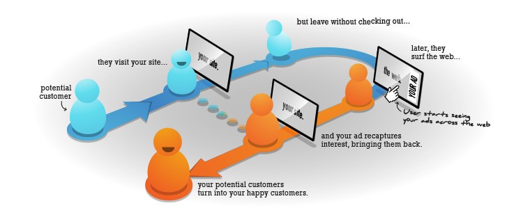
Another method of bringing visitors to your site is with the help of retargeting ads. According to a retargeting platform—AdRoll, Only 2% shoppers convert on first visit to an online store, other 98% is brought by retargeting.
It tracks visitors who visit your website and shows your [retargeting] ads to them when they visit other websites online.
See this:

Abandon Cart Emails
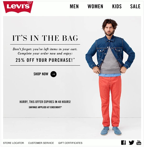
Another great way to get buyers back to your ecommerce store to pull off their purchase is through recovering abandon cart emails.
All you need is to setup personalized emails that are sent to shoppers if they do not complete their order. Perhaps, it’s easy to obtain shoppers name and email ids if you have a multi-page checkout.
A series of one to three emails will be sent out to buyer at set intervals after they abandon their shopping carts and leave your website.
The emails will include:
- Pictures of selected items
- Testimonials or reviews from other buyers
- Return and guarantee policy
- A strong call to action prompting them to come back and purchase

