Once you click on a pay per click ad, you will be taken to a page on the advertiser’s site that would provide you with more information about the products or services featured in the ad. This is the landing page, also known as a lead capture page.
A landing page can serve two purposes:
a. Reference: Gives out more information about the product
b. Transactional: Encourages a visitor to leave his or her contact information or to purchase the product.
A great landing page can turn visitors into customers or leads, so make sure that you spend time tweaking your landing page so that it does not turn off your visitors then make them leave.
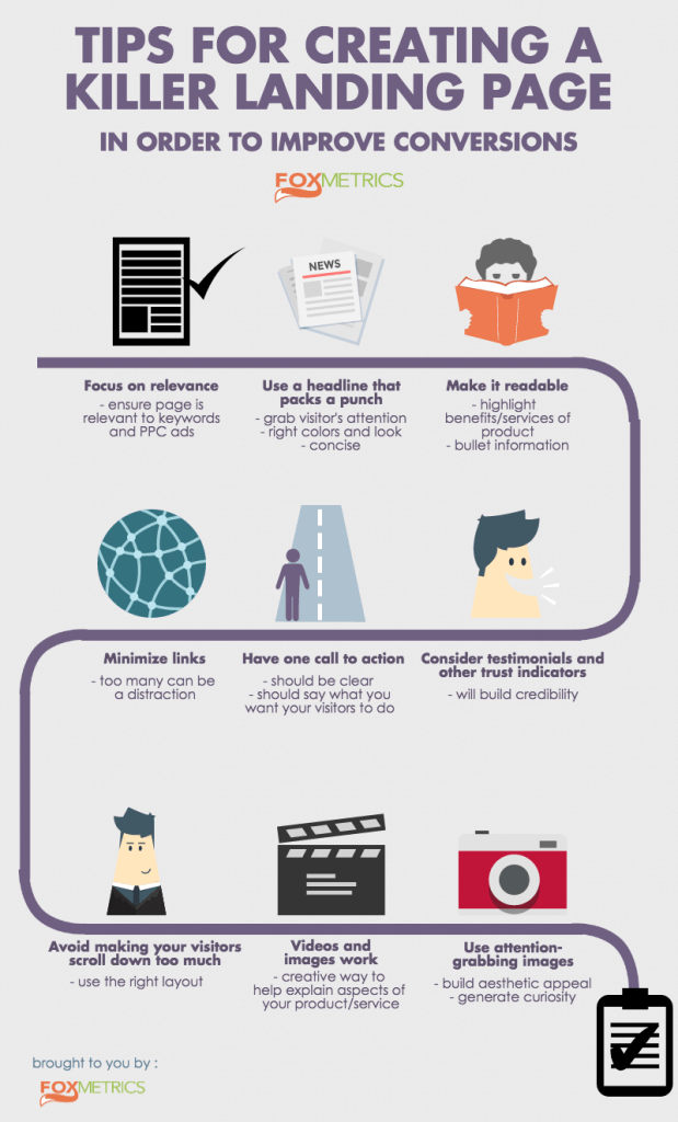
Admittedly, that is easier said than done. So here are some tips on how you could create a good landing page:
1. Focus on relevance.
Be sure that your landing page is relevant to your PPC ad and your keywords. There are just too many benefits in doing so, the biggest of which is that your customers will not feel as if they have been misled into clicking your ad and as if they got an offer they did not expect. What’s more, this will help lower your PPC costs in the long run.
2. Use a headline that packs a punch.
Your headline should make your visitors pay attention. As such, it should be short and sweet, but enough to leave an impact. It should also complement your ad content.
Your headline should have the right colors and an attractive font.
3. Make your landing page readable.
It is understandable if you have a lot to say on your landing page. So organize your thoughts and make your landing page content readable. Some tips in doing this:
Make use of headers or sub-headers for each section that would adequately describe what is written under that section.
Highlight benefits and advantages of using your product or service.
Use bullet points for enumerating things.
Be sure to weed out grammar and spelling errors.
4. Consider putting in testimonials and other trust indicators, such as a Better Business Bureau certification, VeriSign seals and other security services.
5. Have one “call to action”.
A call to action tells your visitors what they should do next. It should explicitly say what you want your visitors to do next after seeing your landing page. It could be as simple as “Buy Now!” or “Sign up now!”.
However, a creative call to action that tells your visitors what they could expect is much better. Instead of saying Buy Now, you could say “No-sweat and No-diet Weight Loss for $30 a month by clicking here” or something to that effect. Be sure to include a keyword in your call to action whenever possible.
Your call to action must be highly visible and should leave no doubt in your visitors’ minds that it is what they need to do. Place it next or near the main headline, in a color that would draw attention. Orange and red are good color choices. Never let your visitor search for your call to action link or button.
Further, avoid confusing your visitors and provide only one call to action. If you want them to buy, there is no sense in having another link there to let them subscribe to your newsletter. Create a separate landing page for that.
6. Minimize links.
Do not distract your visitors by putting up too many links on your landing page. This is the reason why you should take out any navigation links in your landing page. You should also avoid linking out to other pages in your landing page copy.
7. Avoid making your visitors scroll down too much.
Using a good layout along with clear and concise copy, you can
put everything you want to share on your landing page above the fold. Minimize visitors’ need to scroll down to read more about your product.
8. Videos and images work.
Use videos and images that are relevant to what you are selling on your page. If you have a technical or complicated product, videos and images can help explain how it works to users. You could also have a video testimonial or product demo there.
As you can see, landing pages have a lot of elements, layouts, colors and fonts. So be sure to create more than one version of your landing page and test out these versions to see which one works. It would be time consuming, but you will be rewarded with a better conversion rate and a lower PPC cost.
If you’re thinking of personalizing the experience of your visitors, try FoxMetrics for free and Subscribe to our Newsletter get recent updates and news.

